










Busy working mom who is a compulsive shopper and a bargain hunter
(extremely busy, has very little time to shop, likes to get a deal and dress-up)
The scope of the project was to create an ecommerce responsive website for 'Mirror', a global clothing chain with a focus on affordable clothing for any occasion accessible to everyone. Provide an online presence which the customers have been asking for years
Provide a online shopping alternative that is convenient, cheap and fast
(create a responsive eCommerce website that would work seamlessly on all platforms)
Product Designer

Generative Research
Competitor Analysis
User Interviews
Research Findings
UX Strategy Blueprint
Persona
Empathy Map
Storyboard
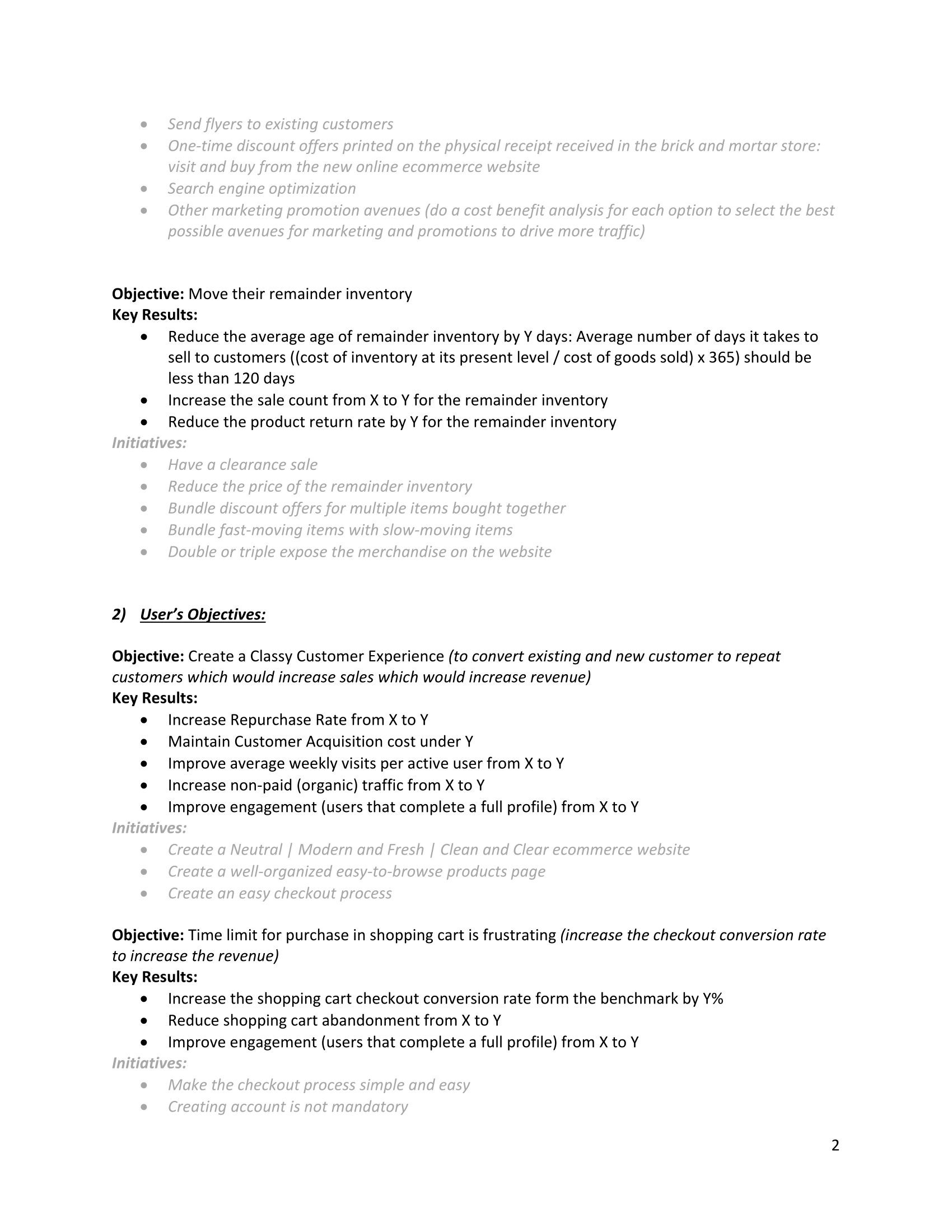
Project Goals
Site Map
Design Alternatives
Task Flow & User Flow
Product Requirements
Wireframes | Responsive Moodboard and Style Tile
High Fidelity Prototype
Usability Testing and Results
Affinity Map
Priority Revisions
UI Kit
Hand Off
In today’s fast-paced digital world, we’ve all become time-deprived bargain-hunters. Online shopping is convenient, cheap and fast compared to brick-and-mortar. Bargain hunters look for deals because they inherently have a need to save.
The ideal ‘MIRROR’ eCommerce website user is Cameron | The Compulsive Bargain Shopper
She is a busy working mom who is a compulsive shopper and a bargain hunter. Shopping a sale is an art from to her. There is no greater thrill than getting a good bargain. Shopping, like love, is a battlefield, sometimes you have to accept the fact that you’re leaving the shopping cart empty, and that’s Okay. You’ll get ‘em next time!
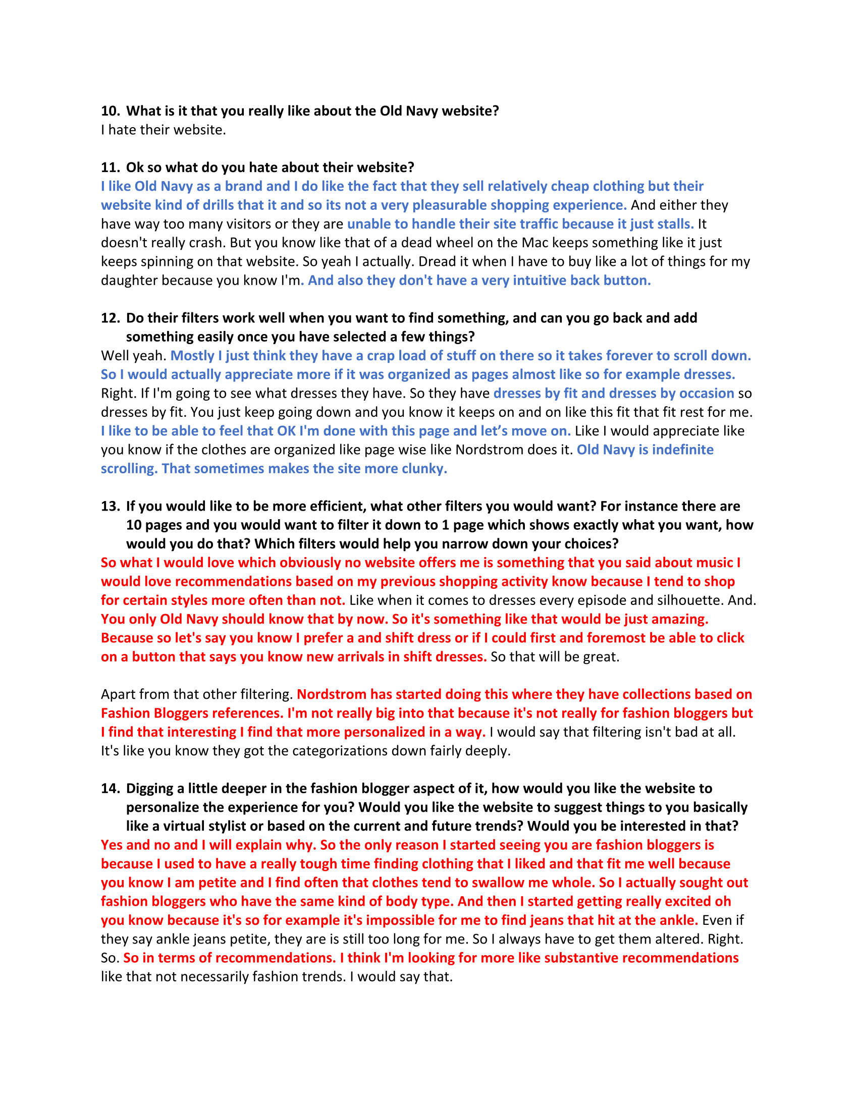
Analysis and synthesis of the 1-1 interviews lead to the following insights:
- Discounts are more important than current fashion trends
- Time limit for purchase in the shopping cart is frustrating
- Infinite scrolling of the items is a huge annoyance
- Substantive, customized recommendations would bring value
- Even though the clothes are cheap, the shopping experience should be classy

Research began by looking at the eCommerce statistics for the Fashion & Apparel industry in the US, to help gain a better understanding of the growth for online shopping in recent times using various portable devices like laptops and smart phones.
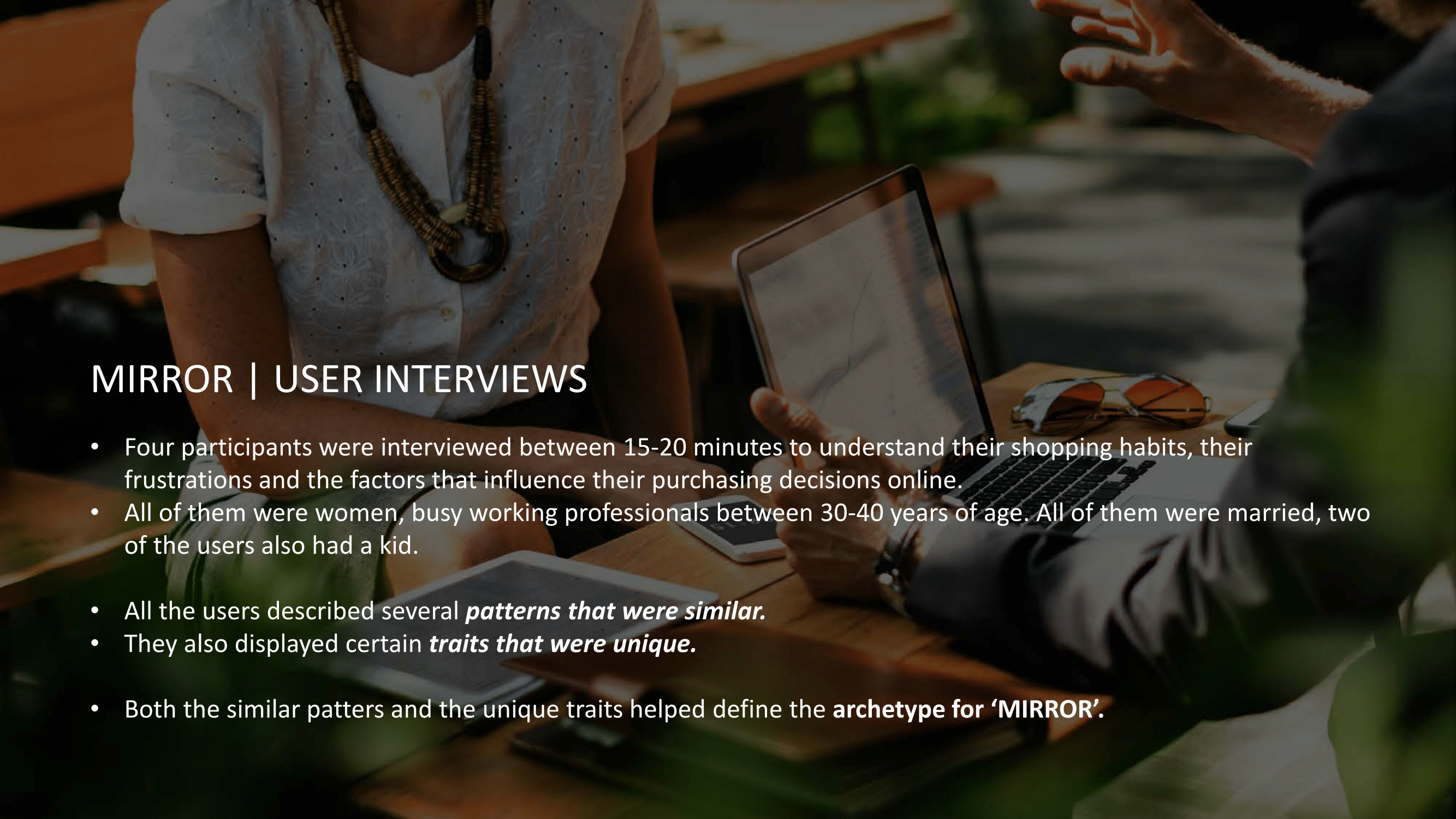
We also analyzed the strengths and weaknesses of Mirror's competitors like H&M, Old Navy, Zara and Nordstrom. The focus was to see what aspects of the online shopping they did well and what could be further improved upon.Four participants were interviewed to understand their shopping habits, their frustrations and the factors that influence their purchasing decisions online. All of them were women, busy working professionals between 30-40 years of age.
All of them were married and two of the users also had a kid.
We quickly realized that discounts where more important than current fashion trends, Customized recommendation brought value to the user and even though the clothes are cheap, they wanted the shopping experience to be classy.
All the users described several patterns that were similar. But they also displayed certain traits that were unique.
From the interview data a persona and an empathy map was created representing the main user group. The persona focuses on Cameron who works full-time at a customer support office in Berkeley, CA. Not a minute goes by where you can find her not on her cell phone or responding to an email on her laptop.
A lot of their friends are recently getting engaged or married so she constantly is on the lookout for dresses. Apart from shopping for her work clothes, she also has to keep updating her son's wardrobe regularly since he is growing up really fast. She is looking for a convenient way to get her clothing needs met while on the go or multi-tasking.


Based on this need we decided to focus on designing a solution that would allow Cameron to buy clothes on the go with ease from anywhere. We generated a number of sketches of various ideas and then focused on the strongest one to refine further. Final sketches were put into a storyboard to show the screen flow from beginning to end.


Using the storyboard both a taskflow and a userflow was mapped out for 'Cameron'.
The userflow shows how Cameron would browse and buy a dress for an upcoming wedding.


Referring to the storyboard and userflow, wireframes were built for each screen of the
userflow using Adobe XD.
Emphasis was put on:
- Creating a classy, simple and elegant shopping experience
- Organize the inventory into pages for ease of browsing- Customized user recommendations
- Discounts and deals


The brand that was created for Mirror is one that represents sustainable, ethical and fair-trade practices. Lime green and brown were chosen as the primary colors to represent these values. The logo embodies these qualities depicted by collapsing the first letter 'M' and the last letter 'R' of the word 'Mirror'. The typeface was chosen to give the brand a simple, modern and elegant look.


High fidelity prototypes for usability testing were created using the mood board and style guide as reference
_page_1.png)
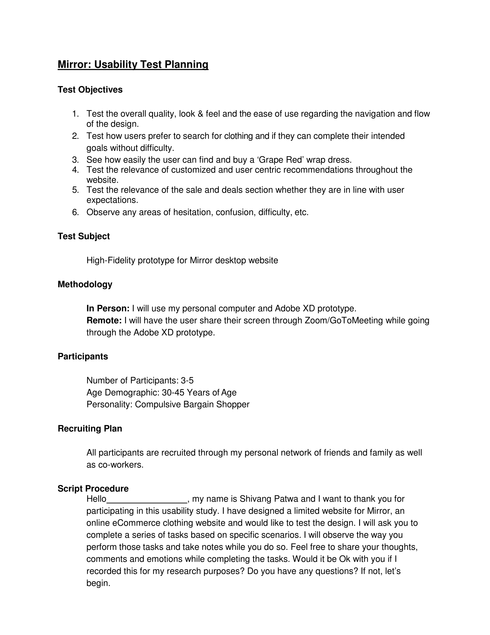
The wireframes were then used to create a high-fidelity prototype for usability testing. Tests were conducted with three users who closely aligned with the target user group. The users were asked a few questions about their online shopping experience and were then given the test. The users were asked to buy a Dress for an upcoming wedding: navigate, browse, select, add to cart and checkout.
Everybody could complete the task easily without much of a problem. There were a few minor issues. Some testers preferred more breathing space between the sections but liked the overall look and feel of the desktop website. A few did not like the 'Added to your bag' pop up on the product page. They preferred that to be much more subtle rather than taking over the entire page.
This feedback helped us iterate upon the initial designs and ultimately create a more user-friendly experience. Priority revisions were made before hand off using Avocode.

_page_1.png)


%20%E2%80%93%202.png)


Worldwide, experts predict that the eCommerce segment of fashion and apparel will increase at a compound annual rate of 10.6% from $408 billion in 2017 to more than $706 billion by 2022. Getting an insight into the world of online retail was extremely fascinating.
Looking back on the project it would have helped to interview retail organizations along with the target users to understand the company's perspective from the backend.
Being a UX Designer gives a unique opportunity to learn about familiar as well as unfamiliar problems and use research-based approach to design solutions that improve people's lives for the better.